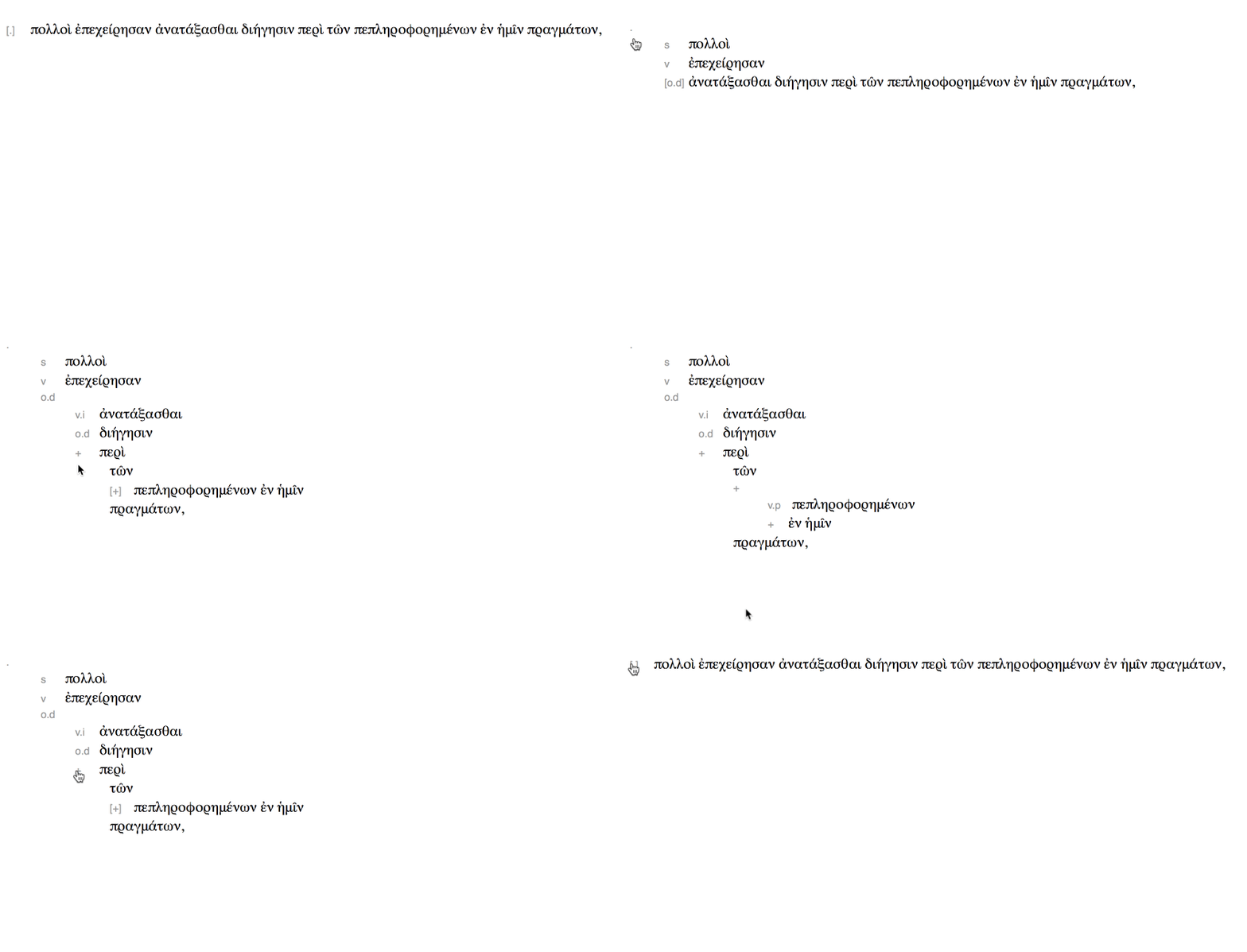
Jonathan Robie's Treedown format is a really nice way of conveying basic syntactic structure in real texts. I recently experimented a little with some code for collapsing and expanding of the structure.
You can read about Treedown in more detail but the idea is to convey structure in a plain text format that still conveys meaning. The name "treedown" is a nod to "markdown" and the philosophy is very similar—convey information visually but in a way that's easy to transmit and edit in plain text.
One of the things that appeals to me about Treedown is how easily it can be used to just initially sketch out high level argument structure without getting into the weeds. But even if the analysis does go a little deeper, you want to be able to pull back and see the high-level structure without getting too much in the way of just reading. So to this end, I hacked together a bit of HTML, CSS and JS to demonstrate some UI to support this "collapsibility".

This is just plain Treedown (or one proposal for it—it's still a work in progress) but with some lightweight interactivity that lets the reader determine how much structure they want to see. Square brackets around the Treedown label indicates a further analysis that can be expanded.
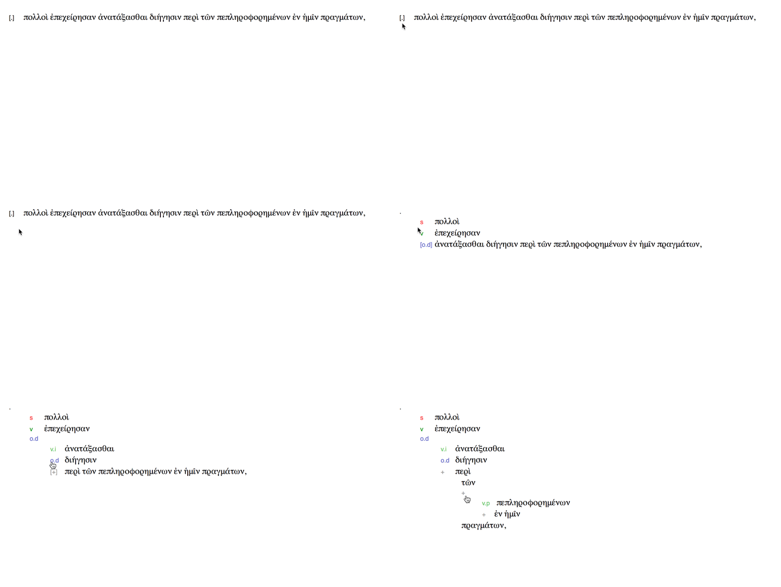
I made a variant that lets you get a "preview" of the next level of structure when you hover over it, using labelled brackets:

I then thought that perhaps this preview might be better conveyed just with colour, where each Treedown label gets its own colour. Here's what that might look like:

There are all just quick prototypes but let me know what you think.